
The Ultimate Colour Match Guide
Discover the art of colour matching with our comprehensive guide, helping you create harmonious palettes, enhance creativity, and ensure consistency in design, fashion, and branding projects.
Colour matching is the process of selecting colours that harmonize and create visually appealing combinations. It is essential in design, fashion, and branding to evoke emotions and ensure consistency. By understanding colour theory and using tools like colour pickers, you can test schemes, adjust saturation, and ensure accessibility. This guide will help you master colour matching, from basics to advanced techniques, ensuring your projects stand out with perfect harmony and visual impact.
Understanding Colour Theory Basics
Colour theory explores how colours interact, focusing on primary and secondary hues, colour models like RGB and CMYK, and the emotional impact of colour combinations in design.
Primary and Secondary Colours
Primary colours—red, blue, and yellow—are the foundational hues that cannot be created by mixing others. Secondary colours, such as orange, green, and violet, are formed by combining two primary colours. This fundamental concept in colour theory helps designers and artists create harmonious colour schemes and understand how colours interact. By mastering these basics, you can build a solid foundation for more complex colour matching and design applications.
The Colour Wheel and Its Importance
The colour wheel is a circular diagram showcasing how colours relate to one another. It arranges primary, secondary, and tertiary colours in a harmonious sequence, making it an essential tool for understanding colour relationships; By using the colour wheel, designers can identify complementary, analogous, and triadic colour schemes, ensuring visual harmony in their projects. It simplifies the process of selecting colours that work well together, enhancing creativity and consistency in various design applications.
RGB, CMYK, and Hex Colour Models
RGB (Red, Green, Blue) is ideal for digital displays, while CMYK (Cyan, Magenta, Yellow, Black) is used in printing. Hex codes represent colours using six-digit alphanumeric codes, commonly used in web design. Understanding these models ensures colour consistency across different mediums. Tools like online colour pickers allow precise extraction of RGB, CMYK, and Hex values from images, aiding designers, marketers, and printers in achieving accurate colour matching for their projects.

Choosing the Perfect Colour Palette
Selecting a colour palette involves starting with a base shade, using tools to explore complementary tones, ensuring contrast for visibility, and testing combinations to achieve harmony and desired aesthetics.
Types of Colour Schemes: Complementary, Analogous, and Triadic
Complementary schemes use colours opposite on the wheel for bold contrast. Analogous schemes feature adjacent hues for harmony. Triadic schemes use three evenly spaced colours for vibrant, balanced palettes. Each offers unique aesthetic benefits, from high energy to subtle cohesion, allowing designers to evoke specific moods and create visually appealing combinations tailored to their project needs.
How to Select Colours for Interior Design, Fashion, and Branding
Selecting colours for interior design, fashion, and branding requires a thoughtful approach to ensure harmony and functionality. Start by identifying a base colour that reflects the desired mood or brand identity. Use the colour wheel to explore complementary, analogous, or triadic schemes, considering intensity and saturation for balance. Test combinations with mood boards, swatches, or digital tools to visualize the final look. For interiors, prioritize functionality and lighting effects; for fashion, align with personal aesthetics and skin tones; and for branding, maintain consistency across all platforms to reinforce recognition and trust. By blending creativity with practical considerations, you can create colour palettes that resonate and endure.
Tools for Creating and Testing Colour Palettes
Utilize online colour pickers and software like Adobe Color or Canva to craft and experiment with palettes. Tools such as Pixlr’s Color Matcher help find precise matches, while mood boards and swatches enable visual testing. Ensure accessibility by checking colour contrast ratios with WCAG guidelines. These resources streamline the process of creating cohesive, visually appealing palettes for any project, ensuring harmony and functionality across designs.

Practical Applications of Colour Matching
Colour matching is essential for interior design, fashion, and branding, ensuring visual harmony and emotional impact. It helps maintain consistency and creates cohesive looks across various mediums and spaces.
Matching Colours for Interior Walls, Furniture, and Decor
Matching colours for interiors involves selecting hues that create harmony and balance. Start by choosing a dominant colour for walls, then pick furniture and decor that complement it. Consider the room’s natural lighting, as colours may appear different at various times of the day. Test swatches and use mood boards to visualize the final look. Ensure the colour scheme reflects the desired ambiance, whether modern, traditional, or minimalist. Professional tools can aid in achieving precise matches, while maintaining accessibility standards ensures the space is inclusive for all. By carefully coordinating colours, you can craft a cohesive and visually appealing environment that enhances functionality and aesthetics.
Colour Matching in Fashion and Accessories
Colour matching in fashion and accessories is essential for creating cohesive outfits. Start with a base colour, then add complementary or analogous shades to enhance your look. Consider the 60-30-10 rule: 60% for the dominant colour, 30% for a secondary shade, and 10% for an accent. Use tools like colour wheels or apps to find harmonious combinations. Test swatches and mood boards to ensure colours interact well. Accessories can add a pop of colour or tie the outfit together, ensuring a polished and stylish appearance that reflects personal style and current trends.
Brand Colour Consistency: How to Maintain Uniformity
Maintaining brand colour consistency ensures recognition and professionalism. Use a centralised colour guide with precise RGB, CMYK, and Hex codes. Train teams to adhere to these standards across all platforms. Regularly audit materials to ensure compliance. Utilise tools like colour pickers and brand style guides. Test colours in different lighting and mediums to avoid variations. Consistent branding builds trust and reinforces identity, making it crucial for long-term success and customer loyalty.
Testing and Refining Your Colour Scheme
Test colour combinations using mood boards and swatches before committing. Ensure accessibility by checking colour contrast ratios. Refine saturation and intensity for visual harmony.
How to Test Colour Combinations Before Committing
Testing colour combinations is essential before finalizing a design. Create mood boards or use fabric swatches to visualize how colours interact. Utilize online tools like Pixlr’s Color Matcher Tool to find precise matches. Test colours under different lighting conditions to ensure consistency. Consider the 60-30-10 rule for balance. Experiment with saturation levels to avoid overwhelming the space. Ensure colour contrast ratios meet accessibility standards for visibility. Refine your palette iteratively until achieving harmony and clarity.
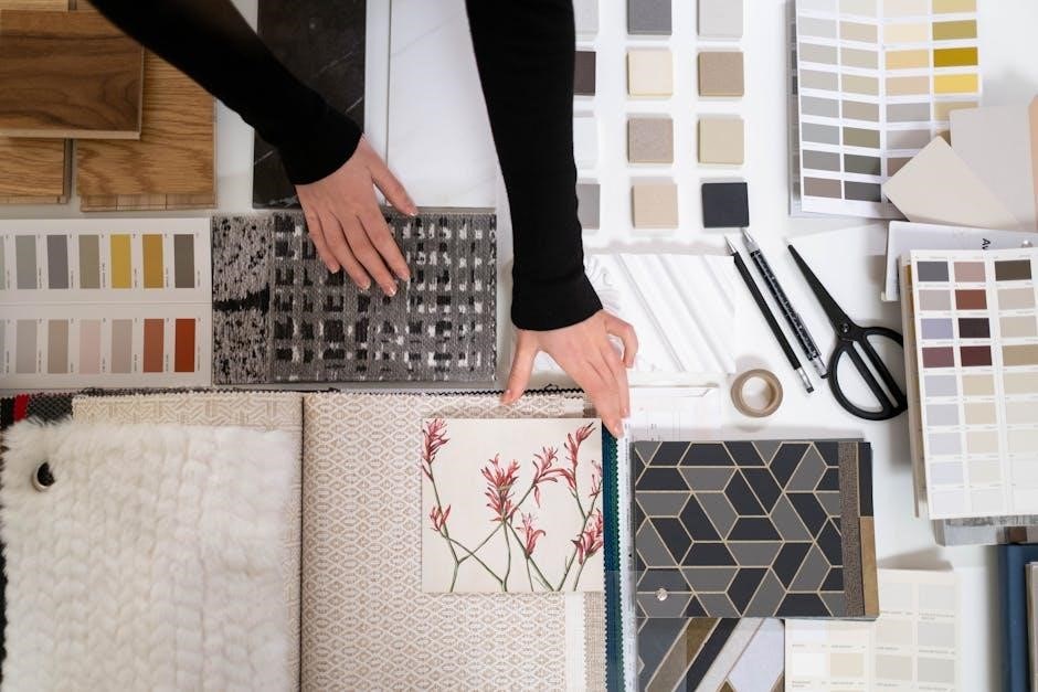
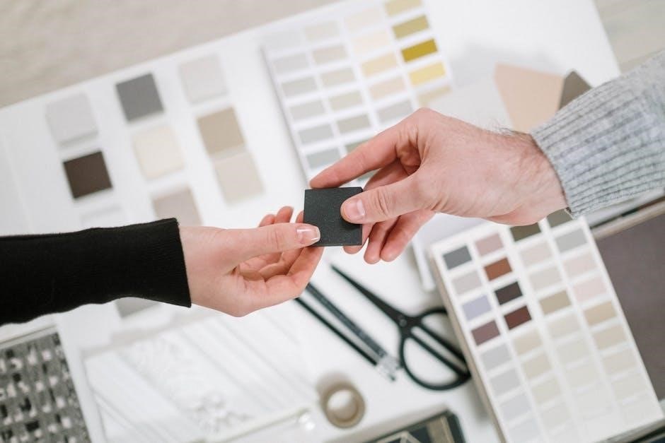
Using Mood Boards and Swatches for Visual Testing
Mood boards and swatches are invaluable for visually testing colour combinations. Create a physical or digital board to assemble fabrics, paints, and materials, ensuring colours complement each other. Swatches allow precise colour matching and comparison. Experiment with different arrangements to gauge harmony and contrast. This tactile approach helps identify potential mismatches before committing to a design, ensuring a cohesive and visually appealing result for interiors, fashion, or branding projects.
Adjusting Saturation and Intensity for Harmony
Balancing saturation and intensity is crucial for creating visually pleasing colour schemes. Lower saturation reduces boldness, while higher intensity enhances vibrancy. Adjusting these elements ensures colours complement each other without clashing. Desaturating bright hues can create subtle harmony, while boosting intensity in muted tones adds depth. Experimenting with these adjustments allows for fine-tuning colour palettes to achieve the desired aesthetic, ensuring balance and visual appeal in any design or space.

Colour Matching Tools and Resources
Discover essential tools for colour matching, from online pickers to professional software. Utilize RGB, CMYK, and hex code generators, plus accessibility guidelines for optimal design solutions.
Online Colour Pickers and Matching Software
Explore online colour pickers and matching software to find precise colour values. Tools like Pixlr’s Color Matcher enable users to extract hex, RGB, and CMYK codes from images. These resources help designers and marketers achieve consistent branding and accessibility, ensuring colours align with project needs. Upload images, analyse palettes, and test combinations to refine your designs effectively.
Colour Contrast Ratio Guidelines for Accessibility
Ensure colours are accessible to all by following WCAG 2.0 contrast ratio guidelines. Use tools like the WCAG Contrast Checker to measure and validate colour combinations. Proper contrast enhances readability and usability, especially for visually impaired individuals. Aim for a minimum ratio of 4.5:1 for normal text and 3:1 for larger text. This ensures content is inclusive and meets accessibility standards, making designs more user-friendly and universally accessible.
Professional Tools for Graphic Designers and Marketers
Advanced tools like Adobe Color, Pantone Color Bridge, and ColorMunki enable precise colour matching and palette creation. These tools support RGB, CMYK, and Hex models, ensuring consistency across digital and print media. Graphic designers can also use Figma and After Effects for seamless colour integration, while marketers rely on tools like ColorPick for branding uniformity. These resources streamline workflows, enhance creativity, and maintain professional standards in colour management and design projects.

Case Studies and Real-World Examples
Explore real-world applications of colour matching in interior design, branding, and fashion. Learn from successful projects and discover how effective colour schemes enhance visual appeal and functionality.
Successful Colour Matching in Interior Design Projects
Interior designers often use colour matching to create cohesive spaces. For instance, selecting paint colours that complement furniture and decor ensures harmony. One approach is to start with a neutral base and add accent colours through rugs or cushions. Testing swatches under different lighting conditions is crucial, as colours can appear differently. Mood boards also help visualize how colours interact. By balancing warm and cool tones, designers craft inviting atmospheres. Additionally, tools like online colour pickers simplify finding the perfect shade.
Brand Colour Strategies That Worked
Brands like Coca-Cola and Nike excel by using consistent colour schemes. Coca-Cola’s red evokes energy, while Nike’s black conveys sophistication. They maintain uniformity across products and marketing, ensuring instant recognition. Tools like colour pickers and software help replicate exact shades. These brands also adapt their palettes for accessibility, ensuring contrast ratios meet guidelines. Their strategies highlight how colour consistency builds brand identity and trust, making them memorable in competitive markets.
Common Mistakes to Avoid in Colour Matching
- Not testing colour combinations in real-world settings before finalizing.
- Ignoring colour models (RGB, CMYK) differences in digital vs. print.
- Overmatching colours, leading to lack of contrast and visual interest.
- Disregarding accessibility by using low-contrast colour schemes.
Mastering colour matching is a powerful skill that enhances creativity and consistency across design, interiors, and branding. By understanding colour theory, testing palettes, and avoiding common mistakes, you can achieve harmonious and impactful results. Whether you’re a designer, artist, or homeowner, this guide provides essential tools and insights to elevate your projects and ensure colours work beautifully together, creating lasting impressions.